Another Hidden London tour, however this one i wasn't 100% sure about when i booked it earlier in the year. 55 Broadway is the headquarters of Transport for London so it was a tour of an office block not railway tunnels or a disused station. An old office block mind you, 55 Broadway was the first skyscraper built in London back in the late 1920s but still... an office block. Would this be as interesting as say Charing Cross or Aldwych?
I needn't have worried, the tour was fantastic. Maybe even the best Hidden London i've been on yet! 55 Broadway is a wonderful building in the Modernist style with Art Deco flourishes. If i could choose an office to work in it would be here. The views from the roof of central London were also fantastic. I highly recommend this tour when they run it again next year. You can see my photos here.
Showing posts with label Design. Show all posts
Showing posts with label Design. Show all posts
Saturday, 21 October 2017
Sunday, 16 April 2017
More Victoria Line tile motifs
Since writing about the tile motifs of the Victoria Line (each station on the tube line has a unique tile motif on the platforms) i have visited 3 more stations on the line and photographed the motifs. You can see them below.
 |
| Vauxhall |
 |
| Pimlico |
 |
| Euston |
Tuesday, 28 February 2017
Thursday, 28 July 2016
Getting the image right
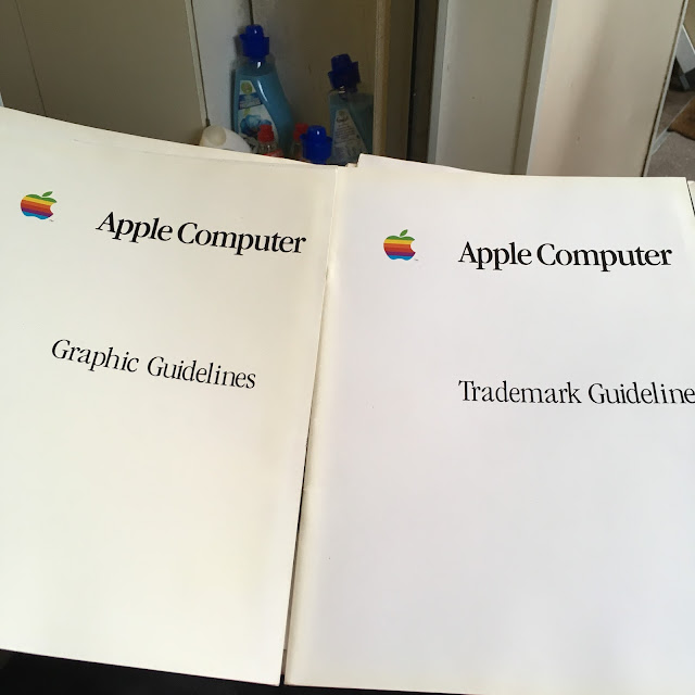
As well as the original manual for the Macintosh which we had a look at earlier in the month there are some other Apple documents in my possession... early 1980s Graphic and Trademark Guidelines!
I got ahold of these after helping someone clear out their computer "junk" a few years ago, thats when i got my original Mac and other assorted Apple toys. To most (normal) people these documents, which describe how Apple's logo, corporate image and trademarks should be properly portrayed are of little interest. However not only am i a Mac fan but i have also spent most of my 20+ year career working in advertising and marketing so i am very familiar with corporate image guidelines and indeed have worked with people who write them. So it was interesting to see Apple's take on it in the early 1980s.
A good proportion the guidelines cover how the logo (the proper 6 colour Apple logo of course) should be used and reproduced. The exact colours to use and the kind of backgrounds to use it on.
Apple made a big deal of the rainbow in the 1980s which was interesting. Although the Apple logo is still the same shape nowadays i do prefer the days of colour...
Subscribe to:
Posts (Atom)


